Page 1 of 1

PostPosted: Tue Sep 24, 2013 12:32 pm
by ScottyB
Heading out to IAANZ this morning and see this!

BEAUTIFUL. wub.gif


PostPosted: Tue Sep 24, 2013 12:41 pm
by Ian Warren
THOUGHT ... ohmy.gif ... America Cup ... ARBUSTS do float ... with those power eggs New Zealand might win ... and if it dose we be able to cut those Sharklets of and make a good Kiwi shark fin stew ... Scotty no need to stop at my place IAANZ
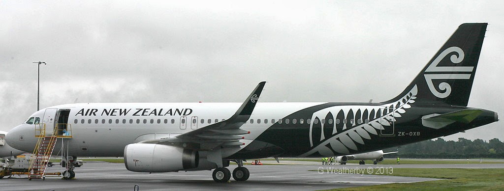
 tongue.gif

PostPosted: Tue Sep 24, 2013 7:20 pm
by FlyingKiwi
Looks a heck of a lot better than the interim livery with the black tail, and the all black design should look even better. I know a lot of people think it looks too "busy" with the Silver Fern and Koru next to each other, but I think it looks quite cool to be honest.

PostPosted: Tue Sep 24, 2013 7:25 pm
by Ian Warren
FlyingKiwi wrote:
QUOTE (FlyingKiwi @ Sep 24 2013,8:20 PM) <{POST_SNAPBACK}>
I know a lot of people think it looks too "busy" with the Silver Fern and Koru next to each other, but I think it looks quite cool to be honest.

I whole heartedly agree .. Gives it that defining look and about time ! It dose look good - looking forward to see it on the 777 and 787.

PostPosted: Tue Sep 24, 2013 7:28 pm
by AlisterC
To be honest for me, the all black scheme on the atr/777 etc was the way to go. This cliche silver fern looks like it was grabbed from a MS Word clip art file somewhere and slapped on. Yuck in my opinion. Will have to see if it grows on me. Thanks for the first pic though Scotty winkyy.gif

PostPosted: Tue Sep 24, 2013 8:24 pm
by deeknow
I love it, very distinctive, the all black is way too heavy looking and gloomy,

PostPosted: Wed Sep 25, 2013 8:00 am
by towerguy
to be quite honest I hate the all black paint scheme. From an operational point of view.
you put an aircraft out on an already busy ramp at night in shitty weather, maybe even two or three of them by the time you add-in a beech and a 777 and you better hope the ground radar keeps working because they are nearly impossible to see.
These designs are great on a drawing board in a well lit office and look great on a plastic model in some overpaid underbrained CEO's office but some of them need to get out in the real world for a change.

PostPosted: Wed Sep 25, 2013 8:37 am
by Ian Warren
towerguy wrote:
QUOTE (towerguy @ Sep 25 2013,9:00 AM) <{POST_SNAPBACK}>
These designs are great on a drawing board in a well lit office and look great on a plastic model in some overpaid underbrained CEO's office but some of them need to get out in the real world for a change.

I wonder if we should get the members to create a scheme over a period of time , i do like that "plastic model in some overpaid underbrained CEO" they are every where and that's starting up the very top with their grubby smirks .

PostPosted: Thu Sep 26, 2013 1:52 pm
by HamiltonWest

PostPosted: Thu Sep 26, 2013 5:01 pm
by Ian Warren
And just as i was going to say that ARBUST did not look to bad the video ends biggrin.gif

PostPosted: Fri Sep 27, 2013 2:40 am
by NZ255
looking good

PostPosted: Mon Sep 30, 2013 7:07 am
by AdrianPetford
I still wish there was teal in there somewhere, but this is a huge improvement on that terrible interim livery. What were they thinking? ohmy.gif

This is really striking and I like the black version even more. clapping.gif

Bring on the repaints! laugh.gif