Page 1 of 1

PostPosted: Wed Jan 19, 2011 1:33 pm
by Splitpin
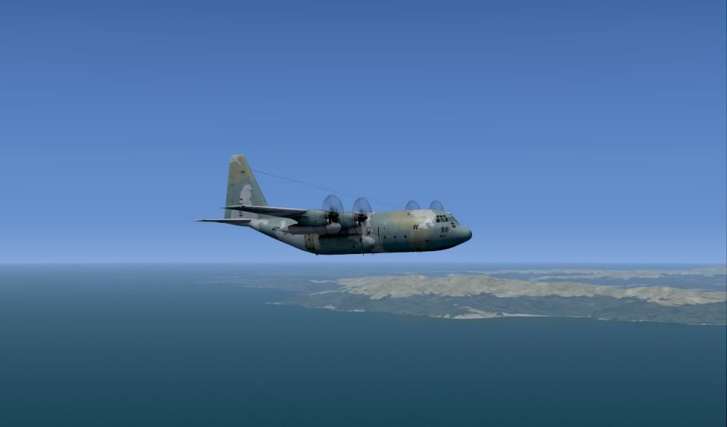
Still down south...this time ex NZNV around the bottom of south westland and up to the spit......wont bore you with all of them.

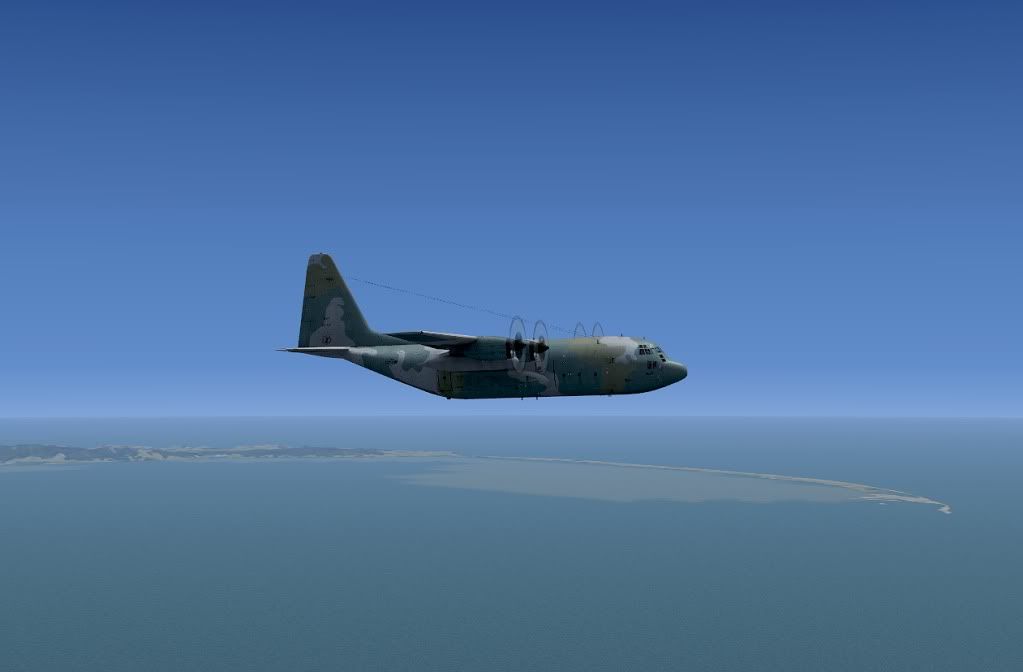
Stewart Island in the background.


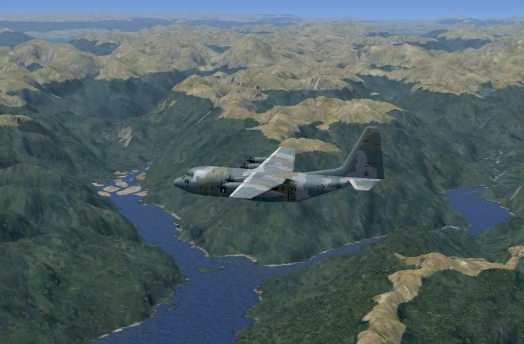
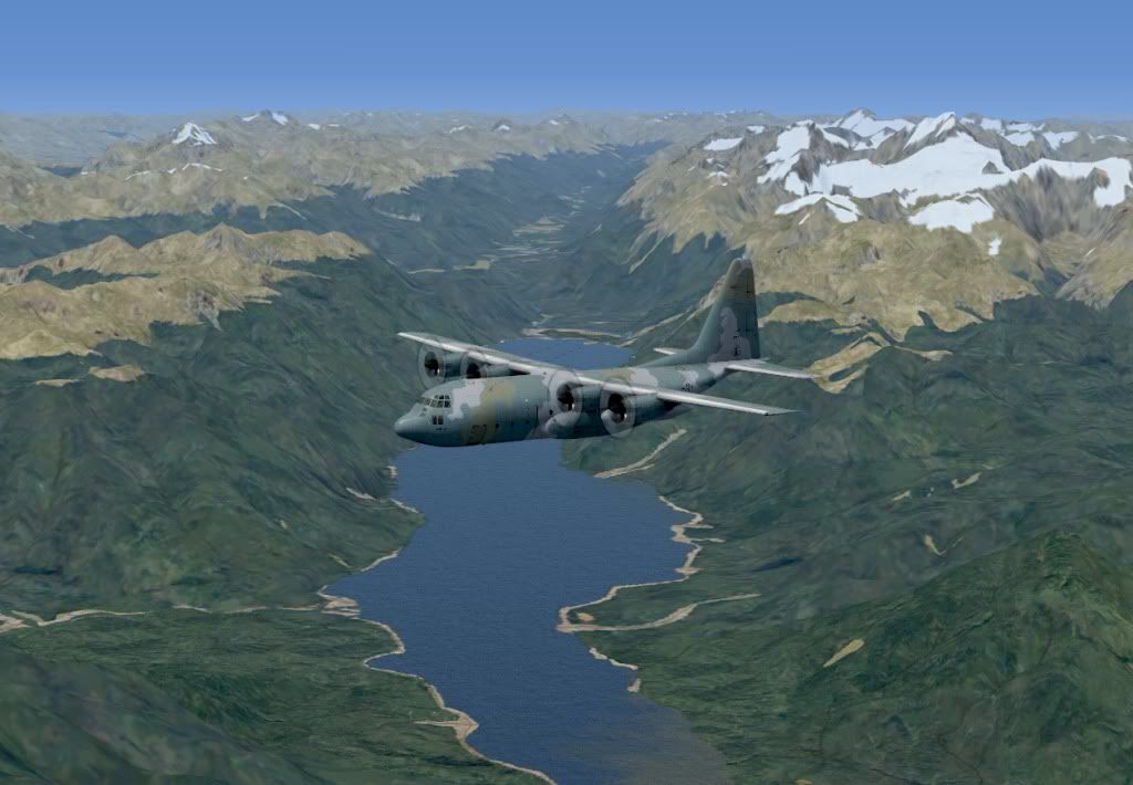
Lake Hauroko to the right of the shot (NZ'sd deepest lake @462mtrs) and Poteriteri to the left


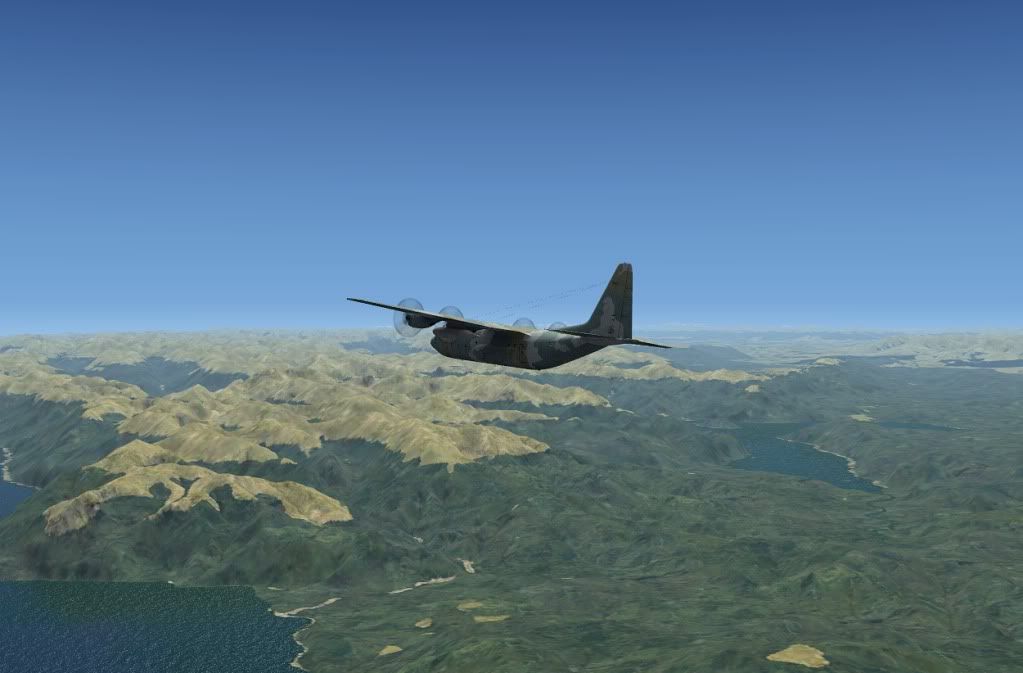
The rest are just heading back up the coast, and then the spit.


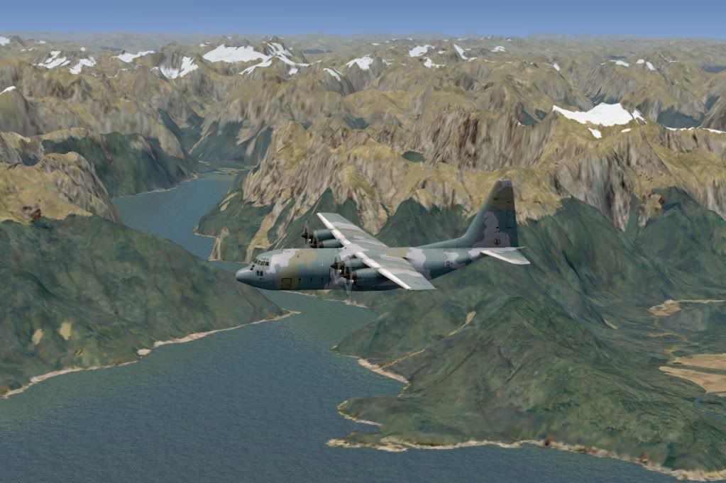
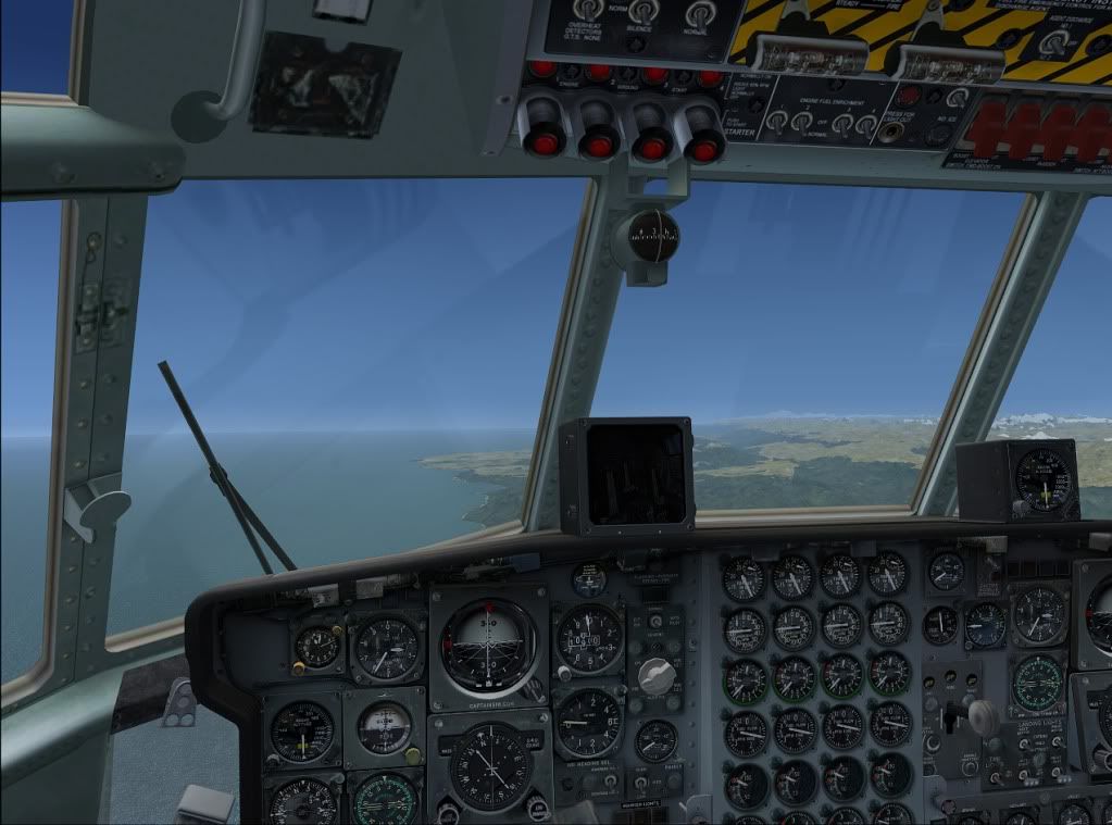
and one from the office


Colour variation is just me playing around with settings

PostPosted: Wed Jan 19, 2011 4:31 pm
by Adamski
Nice (matching) camo scheme! Looks like the "Ghostbusters" logo on the tailfin laugh.gif! Where are you changing the colour settings - when editing the pic or in your video card setup (intrigued)?

PostPosted: Wed Jan 19, 2011 5:09 pm
by Splitpin
Adamski wrote:
QUOTE (Adamski @ Jan 19 2011, 05:31 PM) <{POST_SNAPBACK}>
Nice (matching) camo scheme! Looks like the "Ghostbusters" logo on the tailfin laugh.gif! Where are you changing the colour settings - when editing the pic or in your video card setup (intrigued)?

In the edit....i was playing with high pass filters.....and offset( seems to remove that milky look) ....so much i dont know about all this stuff, so i just play untill i think it looks right.
Its odd, the other day i showed my folks some of the shots Ive taken , and on their monitor they looked awful.....yet on the macbook, they look even better than the original.
I think Macs have always had the edge when it comes to graphics.

Thanks for looking Adam.

PostPosted: Wed Jan 19, 2011 5:14 pm
by H500Fan
as far as realism goes, the first pic I had to take a double take, very impressive!
ahhh brings back memories of long trips in the hercs sleeping on top of a pallet of freight, only way to pass 11 hours of anticipation for my next deployment!

thanks for sharing splitpin smile.gif

PostPosted: Wed Jan 19, 2011 5:55 pm
by Splitpin
H500Fan wrote:
QUOTE (H500Fan @ Jan 19 2011, 06:14 PM) <{POST_SNAPBACK}>
as far as realism goes, the first pic I had to take a double take, very impressive!
ahhh brings back memories of long trips in the hercs sleeping on top of a pallet of freight, only way to pass 11 hours of anticipation for my next deployment!

thanks for sharing splitpin smile.gif

Thanks H5F....i recall those days as well....dreaded going to the can dry.gif that stupid curtain was never high enough unsure.gif There is something hypnotic about a herc trip....maybe its just me, but i always felt safe....just droning along....almost bullet proof....as you said "ahhh brings back memories " The P-3's were first class by comparison....but not the same.

PostPosted: Wed Jan 19, 2011 6:04 pm
by Adamski
Splitpin wrote:
QUOTE (Splitpin @ Jan 19 2011, 06:09 PM) <{POST_SNAPBACK}>
Its odd, the other day i showed my folks some of the shots Ive taken , and on their monitor they looked awful.....yet on the macbook, they look even better than the original.
I think Macs have always had the edge when it comes to graphics.

I used to get into a lot of trouble in my early web design days, when I did all the graphics on a Mac. Basically, the *gamma* on all Mac monitors (as well as maybe the default settings on the card) were always substantially different. I'd spend hours working in very subtle areas of shadow only to find PC monitors turned them to mud (or plain black). Also, the dot pitch on Mac monitors was always finer, so text always looked a lot smaller.

I thought that, with the advent of LCDs and Apple using cheaper/more standard monitors, these problems had gone away. Maybe they haven't! I don't own a Mac, so can't compare, these days, but a few of my clients are Mac-based design companies and they haven't complained (yet!).

PostPosted: Wed Jan 19, 2011 6:11 pm
by Ian Warren
Its just a pleasure to see many more using CS130s .. with VLC yeah in hog heaven , the valley flying cool.gif

PostPosted: Thu Jan 20, 2011 12:18 pm
by Splitpin
Adamski wrote:
QUOTE (Adamski @ Jan 19 2011, 07:04 PM) <{POST_SNAPBACK}>
I used to get into a lot of trouble in my early web design days, when I did all the graphics on a Mac. Basically, the *gamma* on all Mac monitors (as well as maybe the default settings on the card) were always substantially different. I'd spend hours working in very subtle areas of shadow only to find PC monitors turned them to mud (or plain black). Also, the dot pitch on Mac monitors was always finer, so text always looked a lot smaller.

I thought that, with the advent of LCDs and Apple using cheaper/more standard monitors, these problems had gone away. Maybe they haven't! I don't own a Mac, so can't compare, these days, but a few of my clients are Mac-based design companies and they haven't complained (yet!).

Thanks for clearing that up, i didnt know about the dot pitch thing. I dont use the mac for anything much.....maybe i should learn about them. I guess if your going to do anything along the lines of public graphic displays, or even screenshots, it might pay to mention which seetings will show it off to advantage. Its all in the eye , or the screen of the beholder.