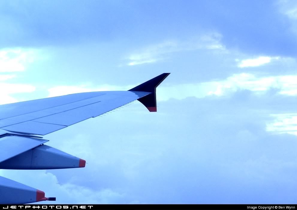
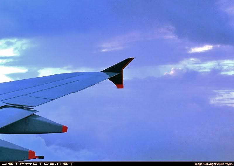
Yes, when you look at the blue channel, it is very blown out -- so no matter how you adjust the colour, you won't be able to recover the correct blue balance. Is the original any different? I notice that your sig is very blue as well -- maybe this is a problem with your camera, or your monitor, or you just like blue:)
I've done two things here, first I've just worked on the blue channel, putting some contrast back. Then I've darkened the overall image a little (only by shifting the tone balance, which is Levels in PhotoShop), as I suspect that the aircraft colours are a little washed out. I would consider lowering the saturation a little as well, as the alterations have boosted it a little, and it was quite saturated to start with.
You'd get a better result starting with the original image, though. The main goal is the least number of adjustments, which will give the least amount of damage to the final image.
However I do think that the main problem with the image is that I can't figure out the subject. If it meant to be the wing, then too much of it is cropped off. The tip should be right over the right side of the image. If it is meant to be the sky, then it just doesn't have enough oomph. I suspect that the sky looked a lot better when you took the pic, but has lost a little magic to your camera's limitations.


 haha nice work bro!