New Air New Zealand scheme
12 posts
• Page 1 of 1

![]() by Ian Warren » Sat Jul 21, 2012 4:33 pm
by Ian Warren » Sat Jul 21, 2012 4:33 pm
Easier for our painters to paint .. but a bit boring ... gone colour photos 

-

Ian Warren - NZFF Pro
- Joined: Fri May 05, 2006 5:23 pm
- Posts: 41187
- Location: AREA 51
![]() by FlyingKiwi » Sat Jul 21, 2012 7:06 pm
by FlyingKiwi » Sat Jul 21, 2012 7:06 pm
Not sure what I think of it, I'm glad they've kept the Koru the same but this seems like a bit of a "cheap" livery to me - just keep the same thing but ditch the colour!
-
FlyingKiwi - Senior Member
- Joined: Mon May 29, 2006 4:17 pm
- Posts: 1688
- Location: Auckland
![]() by Ian Warren » Sat Jul 21, 2012 7:10 pm
by Ian Warren » Sat Jul 21, 2012 7:10 pm
FlyingKiwi wrote:QUOTE (FlyingKiwi @ Jul 21 2012,8:06 PM) <{POST_SNAPBACK}>but this seems like a bit of a "cheap" livery to me - just keep the same thing but ditch the colour!
Agreed , sad state to display to the World .. All Blacks .. maybe a Silver Fern wrap on the real fuselage as well would equal and really go with the livery
-
Ian Warren - NZFF Pro
- Joined: Fri May 05, 2006 5:23 pm
- Posts: 41187
- Location: AREA 51
![]() by FlyingKiwi » Sun Jul 22, 2012 3:12 pm
by FlyingKiwi » Sun Jul 22, 2012 3:12 pm
It would have been too much to hope for the all-black livery on the whole fleet as it's very expensive to maintain, but it would have been nice to at least have a black wave or something along the side of the fuselage.
-
FlyingKiwi - Senior Member
- Joined: Mon May 29, 2006 4:17 pm
- Posts: 1688
- Location: Auckland
![]() by toprob » Sun Jul 22, 2012 3:48 pm
by toprob » Sun Jul 22, 2012 3:48 pm
I guess that Kris Sowersby is the closest NZ has to a typographical superstar, and he has done some great stuff. If the goal here was to modernise the image, then I suppose it works, but the old typestyle still had a lot of life left in it -- just enough of a touch of the 'classic' airlines, but still nice clean modern lines. Oh well, I normally have no trouble defending new fonts/logos, but in this case I'm happy to be a grumpy old fart.
Good idea to go 'black', but this doesn't do it for me. I never want to know what this makeover cost them.
Good idea to go 'black', but this doesn't do it for me. I never want to know what this makeover cost them.
-

toprob - NZFF Pro
- Joined: Sat Apr 29, 2006 4:56 pm
- Posts: 6718
- Location: Upper Hutt
![]() by cowpatz » Sun Jul 22, 2012 3:57 pm
by cowpatz » Sun Jul 22, 2012 3:57 pm
In a word...dull. Well I could use several but it's not really all that inspiring is it?
One of the problems discovered this year with having an all black aircraft is that it makes it a nightmare for the engineers to search for lightning strike damage.
One of the problems discovered this year with having an all black aircraft is that it makes it a nightmare for the engineers to search for lightning strike damage.
Remember the 50-50-90 rule. Anytime you have a 50-50 chance of getting something right, there's a 90% probability you'll get it wrong!

-

cowpatz - NZFF Pro
- Joined: Wed Mar 07, 2007 3:28 pm
- Posts: 3747
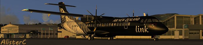
![]() by AlisterC » Sun Jul 22, 2012 10:18 pm
by AlisterC » Sun Jul 22, 2012 10:18 pm
Cowpatz said it.. DULL (note capitals required)
Air NZ really are falling behind the times when it comes to world leading airliner liveries.. There are some spectacular ones out there, and considering Air NZ are renowned for pretty much everything else they do, surely it would be easy to be well known for how great our planes look as well? This is a cop-out if you ask me. I guess it's good the fleet will have some special liveries to improve the overall average
Air NZ really are falling behind the times when it comes to world leading airliner liveries.. There are some spectacular ones out there, and considering Air NZ are renowned for pretty much everything else they do, surely it would be easy to be well known for how great our planes look as well? This is a cop-out if you ask me. I guess it's good the fleet will have some special liveries to improve the overall average
-

AlisterC - NZFF Pro
- Joined: Thu Jul 20, 2006 11:13 am
- Posts: 2543
- Location: Nelson, NZ

![]() by Ian Warren » Fri Jul 27, 2012 11:50 am
by Ian Warren » Fri Jul 27, 2012 11:50 am
Bluebird wrote:QUOTE (Bluebird @ Jul 27 2012,11:00 AM) <{POST_SNAPBACK}>why can't they just do a aircraft in a retro paint??
Todd
The old T.E.A.L /Air New Zealand , reacon would look nice on a triple 7
-
Ian Warren - NZFF Pro
- Joined: Fri May 05, 2006 5:23 pm
- Posts: 41187
- Location: AREA 51
![]() by deaneb » Sat Jul 28, 2012 7:40 pm
by deaneb » Sat Jul 28, 2012 7:40 pm
Bloody awful and boring. Hate to think what some designer was paid to come up with that. A font change and remove all the colour! Even using dark blue instead of black would look better.
-

deaneb - Senior Member
- Joined: Sat Aug 12, 2006 4:40 pm
- Posts: 1561
- Location: Blenheim
12 posts
• Page 1 of 1
Return to New Zealand Aviation
Who is online
Users browsing this forum: No registered users and 3 guests